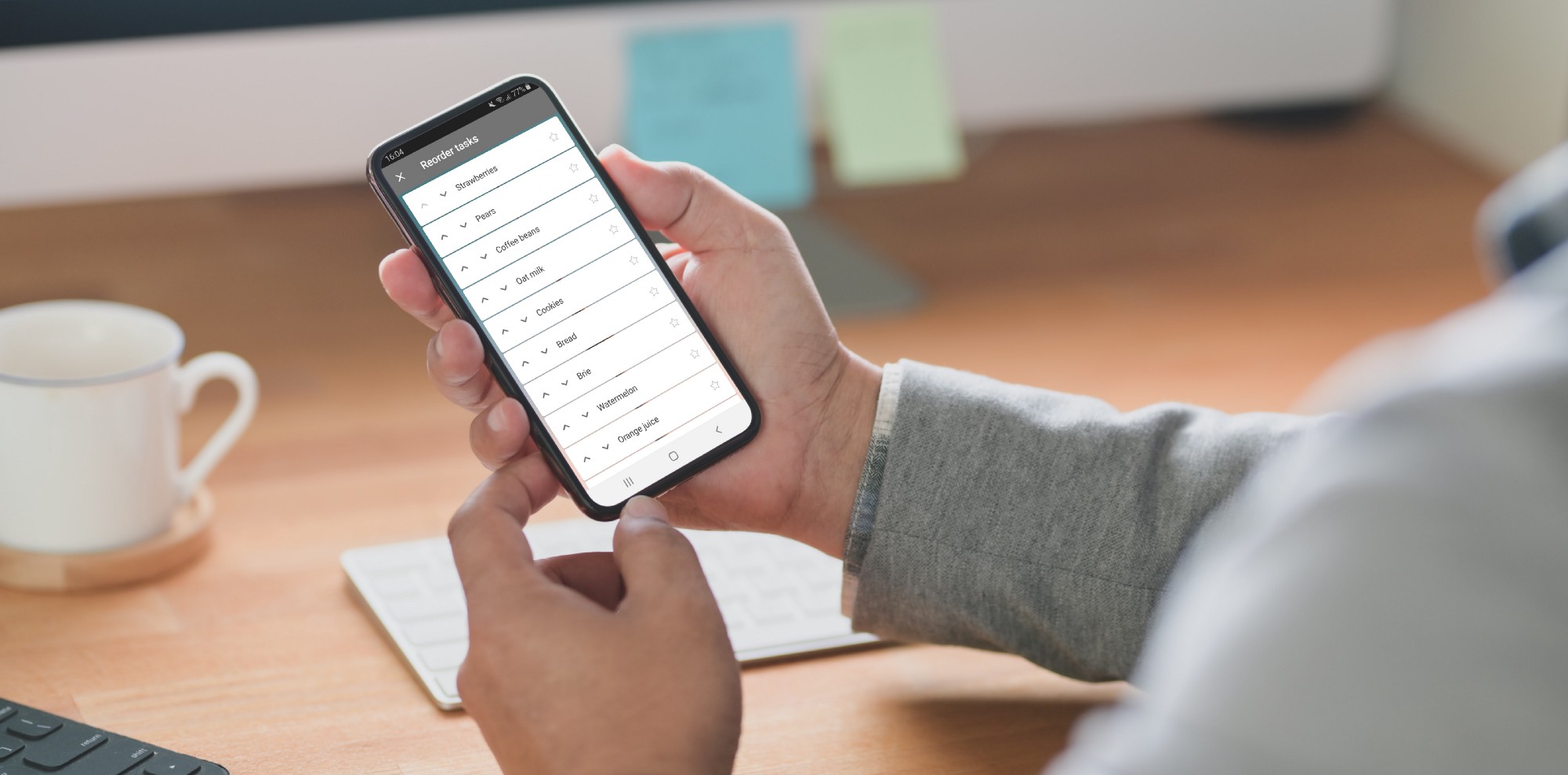
In Microsoft To Do we put a lot of work into making our features available for everyone using our apps. We discovered that the way our task reordering was implemented was not accessible and this is how we approached this problem.
Drag and Drop Challenges
In Microsoft To Do apps the functionality to reorder the list of tasks was only available via drag and drop, which uses pointer gestures. Pointer gestures work well to allow user interaction with the interface directly, however not every user is able to carry out these gestures. The following user groups could struggle with this approach in different ways:
- Users with motor disabilities might not be able to accurately execute the gesture.
- Users using a keyboard or other input device might not be able to carry out gestures at all.
- Users navigating via Talkback might find it hard to accurately drag an item without seeing where it is going.
- Other users might be simply unfamiliar with drag and drop interaction and not be able to discover it easily when using the app, therefore missing out on this feature.
We were going to keep the existing drag and drop implementation, as it is already used by many of our users and it is an important part of our app. However, we also needed to remove the barrier which prevented some of our users from reordering the list. As such, we decided to tackle this challenge and find an alternative way to reorder users who were not using pointer gestures. We had to get creative to find a solution.
Research
As we began researching potential solutions, we found some resources which looked promising.
- Harris Schneiderman described a great approach on Smashing Magazine which uses aria live regions and a keyboard to reorder items.
- Jesse Hausler and Cordelia McGee-Tubb shared accessible drag and drop approaches from Salesforce, making use of aria live regions and attributes as well.
- In the Accessibility Club Summit 2019 here in Berlin, Sergei Kriger shared strategies on how to make draggable components usable to people relying on screenreaders .
These resources were really helpful when trying to understand the problems experienced with drag and drop, the functionality that would need to be provided and the announcements which are expected by the users who use a screenreader.
These solutions, however, mainly relied on keyboard navigation. Of course external keyboard can be used with mobile phones, but we would not expect every user who wants to reorder their list to use one. We needed a solution which did not rely on additional accessories.
Design Explorations
reorder_We started with Android in order to allow us to focus on one platform at a time and test our concepts before expanding to other clients. We decided to incorporate action mode, which is common in Android apps to allow users to enable reorder mode. Two potential concepts then emerged for how the interaction would work from there.
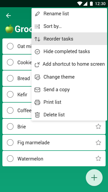
Screenshot showing “Reorder tasks” option in overflow menu
Concept 1
When reorder mode is active, we show buttons on each item to allow the user to move the item up or down by one space. As items move, the focus stays with the selected item, so Talkback and keyboard users do not lose their place in the list. This approach only allows the user to move one item at a time, so it might take a long time to reorder everything if the list is very long (this limitation also applies to drag and drop).
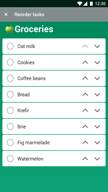
Mockup of grocery list with up and down buttons on each item cell
Concept 2
For this concept, the user needs to select one or multiple items first before moving them. We show the buttons at the top which allow the user to move all selected items either by one space or all the way to the top or bottom of the list. This approach is more powerful, allowing the user to arrange multiple items at a time. The challenge here is managing the focus between the list and the top bar and making it clear to the user how to select items before moving.
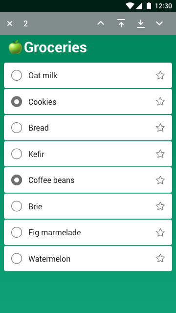
Mockup of a grocery list with some items selected and controls to move items at the top action mode
Verifying Concepts
To verify concepts we worked in parallel; while I was prototyping the concepts in a sample app to figure out technical challenges for both approaches, Lene built design prototypes which we sent to user testing to gather feedback. Ioannis has arranged user testing via usertesting.com. Testing remotely allowed us to get the results back very quickly. 9 participants tried out both concepts at randomised order, which ensured the test was not biased towards one solution .
We found out that the reorder feature was easily discoverable in both cases, though some participants started by trying drag and drop straight away, showing familiarity with how reorder would normally work in Android apps. There were no concerns over how to exit reorder mode. With concept 1 some testers were lacking the option to move multiple items at a time, while with concept 2 there was some confusion over selecting items first and distinguishing between the buttons for moving one space at a time versus all the way to top/bottom.
By observing the user interaction with the prototypes, we could clearly recognise a preference for concept 1 by most of the participants.
When it came to code prototypes, concept 2 needed additional work to make item selection and focus changes clear and easily discoverable, where concept 1 was much more straightforward to implement and to add to current Microsoft To Do codebase.
To sum up, these were the main properties of each approach:
- Drag and Drop
- discoverable if user is already familiar with Android ecosystem
- not accessible without pointer gestures
- challenging to use with Talkback
- Concept 1
- easily discoverable
- intuitive
- accessible without pointer gestures
- works with Talkback and keyboard
- Concept 2
- easily discoverable
- powerful interface, allowing multiple item reordering
- needs more work to make the interface clear
- accessible without pointer gestures
- unclear Talkback and keyboard navigation
Based on our technical explorations and the user testing results, we decided to work on releasing concept 1 to provide the currently missing functionality, then would gather user feedback and revisit this feature at a later date to make further improvements.
Implementation
Microsoft To Do Android app uses RecyclerView for displaying the tasks in the list. We added additional reorder options to the overflow menu and used ActionMode.
ActionMode.Callback was used for adjusting the interface for reorder mode and then setting it back after the user finished reordering the list items. Our RecyclerView.Adapter includes a new mode for reorder, which refreshes the list elements and shows new buttons on each ViewHolder for moving item up/down.
ActionMode Callback example
The other interfaces are also simplified when reorder mode is open, including removing a button for creating new items and modifying the items themselves to show only information relevant for reordering. For some elements views were disabled rather than completely hidden. For example, the user can still see the importance of the item while in reorder mode, but cannot mark the item as important until reorder mode is exited. This improves the user experience by making sure users can clearly focus on the task at hand — reordering. It also makes Talkback and keyboard navigation simpler, by not having as many elements to go through.
Accessibility announcements were also used to inform Talkback users about the changes. This included announcements for opening and closing reorder mode, as well as announcements when the item is moved up or down.
As the user navigates through the list and moves the items, it is also important to keep the focus on the right item. It ensures the user keeps their place in the list and does not have to navigate through the entire list again after an item is moved. This was achieved by using techniques covered in a previous blog post about Android accessibility.
To sum up
This is what the final result in the Microsoft To Do app looks like. The feature has been released — download Microsoft To Do and try it out yourself!
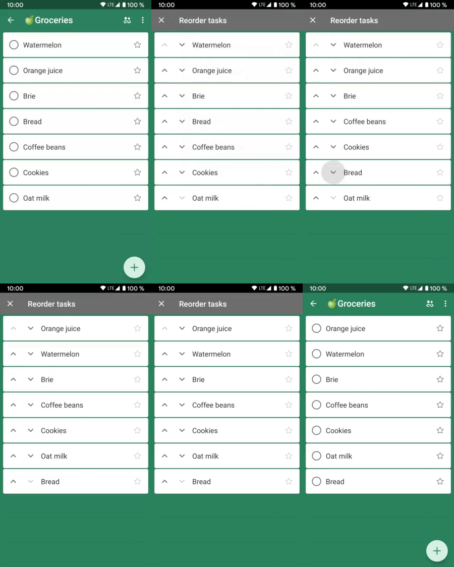
GIF showing reorder mode flow
We learned a lot about how to handle pointer gestures while working on this. We are sharing our approach with the community as we want to help more teams to support the needs of every user in their apps. Have you worked on any difficult accessibility problems? We would love to read about the solutions you came up with!
Participants from Microsoft To Do team
- Sigute Kateivaite — research, code explorations, Android implementation / twitter.com/Sigute_K
- Lene Rydningen — research, design concepts and prototypes / www.lenerydningen.com
- Ioannis Kiossis — user testing / twitter.com/ioakio
Notes
This article was first published on Android@Microsoft Medium publication here.
