
Many Android applications suffer from similar Talkback issues and at Microsoft To Do we run into these often as well. We use multiple strategies to make our app more accessible. This article covers a few scenarios where Talkback experience is improved.
A companion Github repository containing the sample code is available here. You can check it out and try running the demo app on your device to experience the issues and try the solutions yourself.
Combining views into groups
Not everything visible on the screen is meaningful; some views are used only for decoration, some images illustrate the text without adding additional information, and sometimes multiple views convey the meaning together but do not make sense separately. In these cases, the views can be combined to allow Talkback user to quickly navigate entire view, rather than having to skip through multiple different elements.
Example
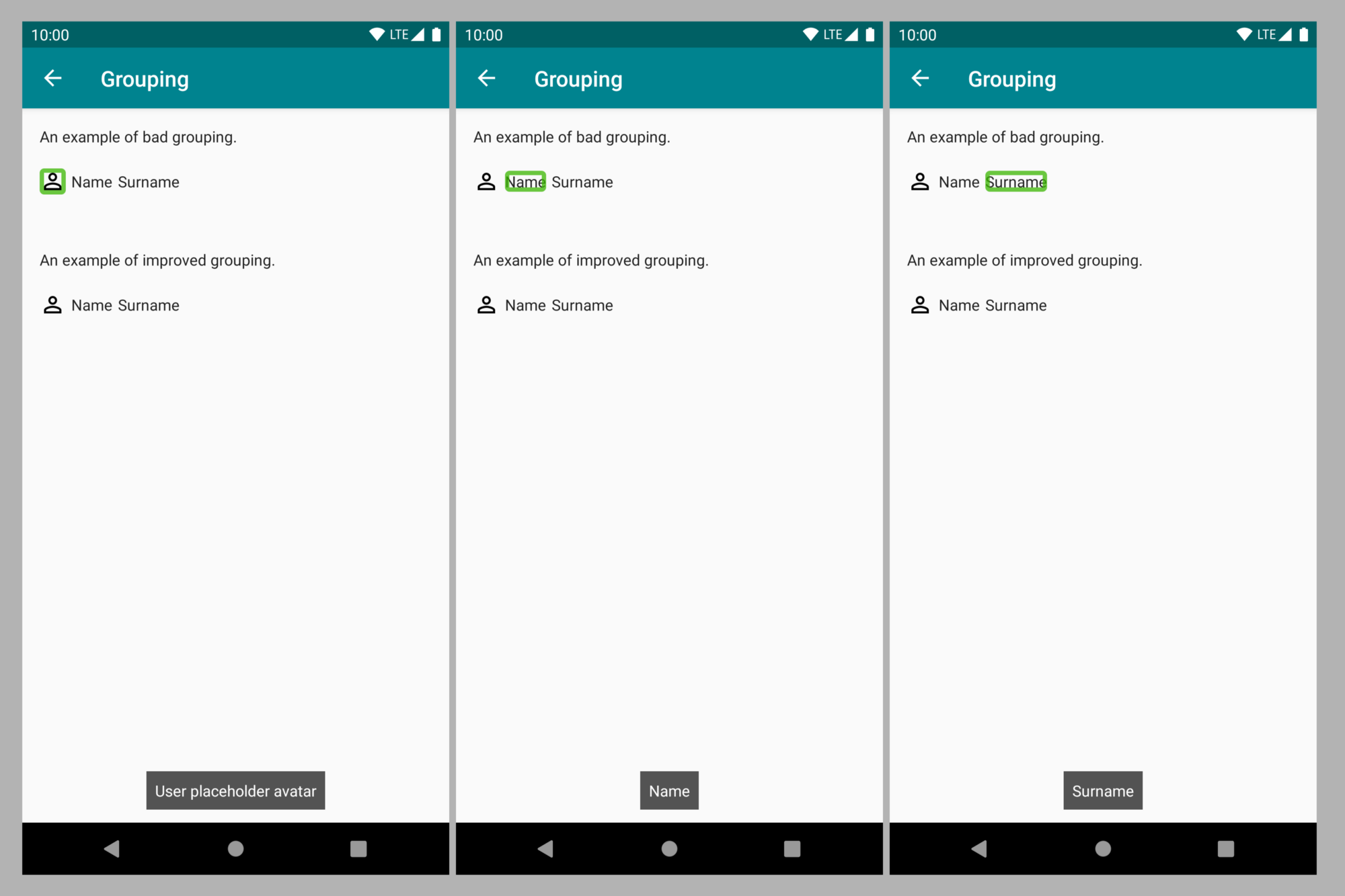
Screenshot showing Talkback navigation over ungrouped elements
Talkback reads the user element on the page as “User placeholder avatar”, “Name”, and then “Surname”. Each element can be navigated individually. The user icon is a placeholder which does not provide additional information. It takes three swipes to navigate through the element.
Solution
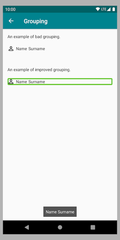
Screenshot showing Talkback navigation over group
Content description is set on the entire group so Talkback reads only one label, containing all user information as “Name Surname”. Now navigation is done in only one swipe.
XML layout snippet
Content description is set on LinearLayout, child views are marked as not important for accessibility individually.
Action descriptions
As Talkback navigates the elements with click actions, the announcement generated will include some information, for example “Login, Button, Double tap to activate”. However, relying on default announcements is not always enough.
Example
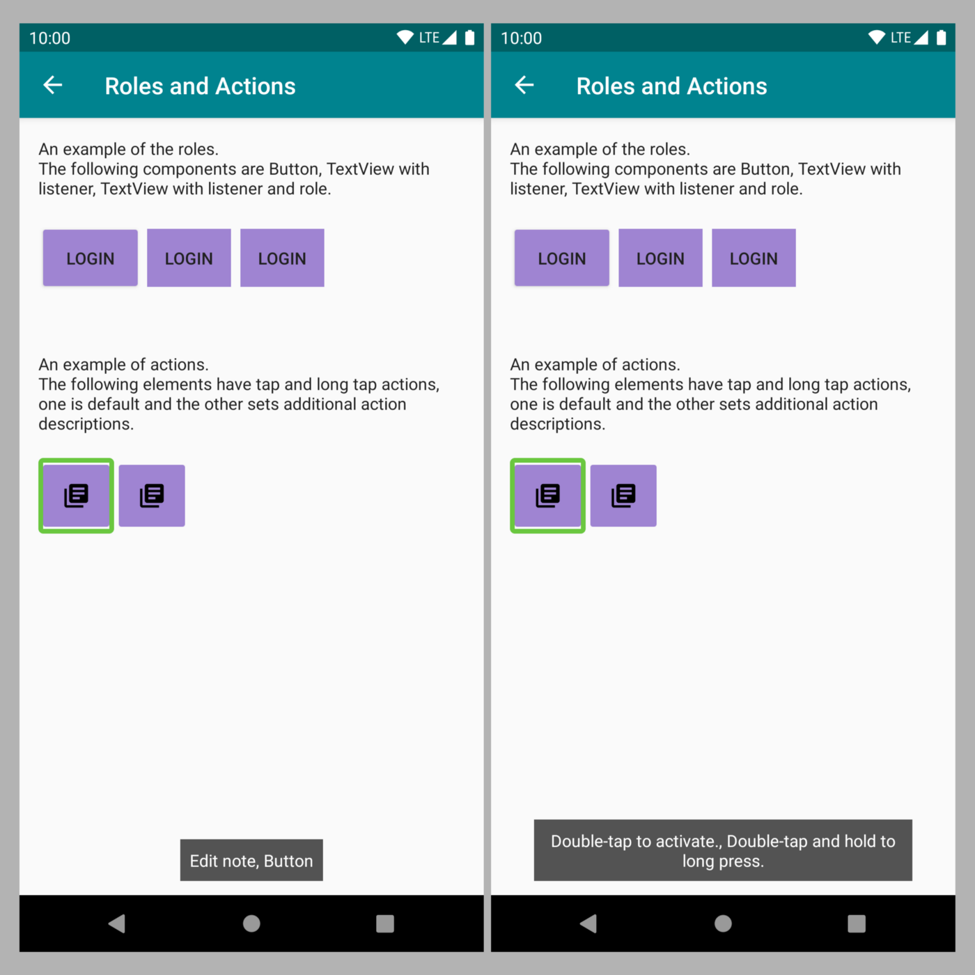
Screenshot showing Talkback announcements for the Button without custom actions
A button with two actions generates an accessibility announcement of “Edit note, Double tap to activate, Double tap and hold to long press”.
Solution
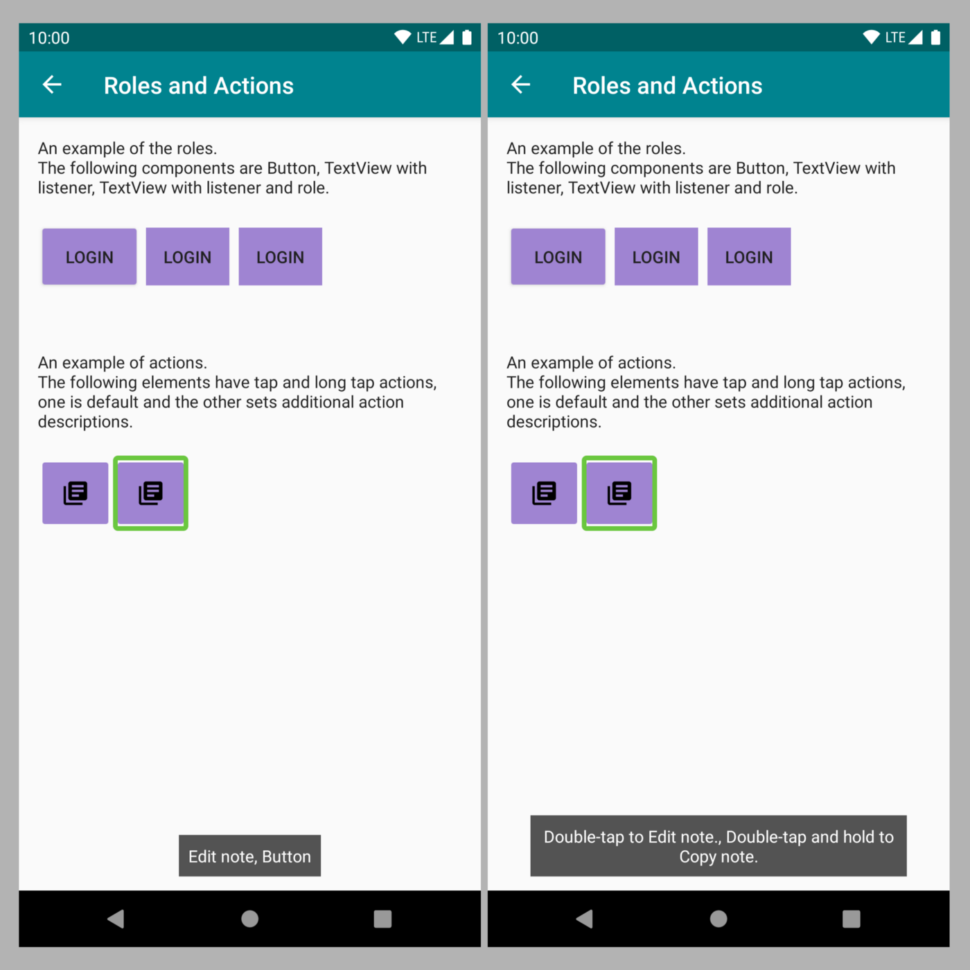
Screenshot showing Talkback announcements for the Button with custom actions
Actions are modified to announce “Double tap to edit note, Double tap and hold to copy note”.
Code snippet
Custom actions are added in accessibility delegate, ensuring that it’s clear what happens when each action is carried out.
Roles
Talkback reads the element roles, such as Button, Switch, Checkbox, etc. This gets complicated when non-standard elements are used. For example, adding a click listener will add an action to Talkback announcement, but the role will generally not change, potentially causing confusion.
Example
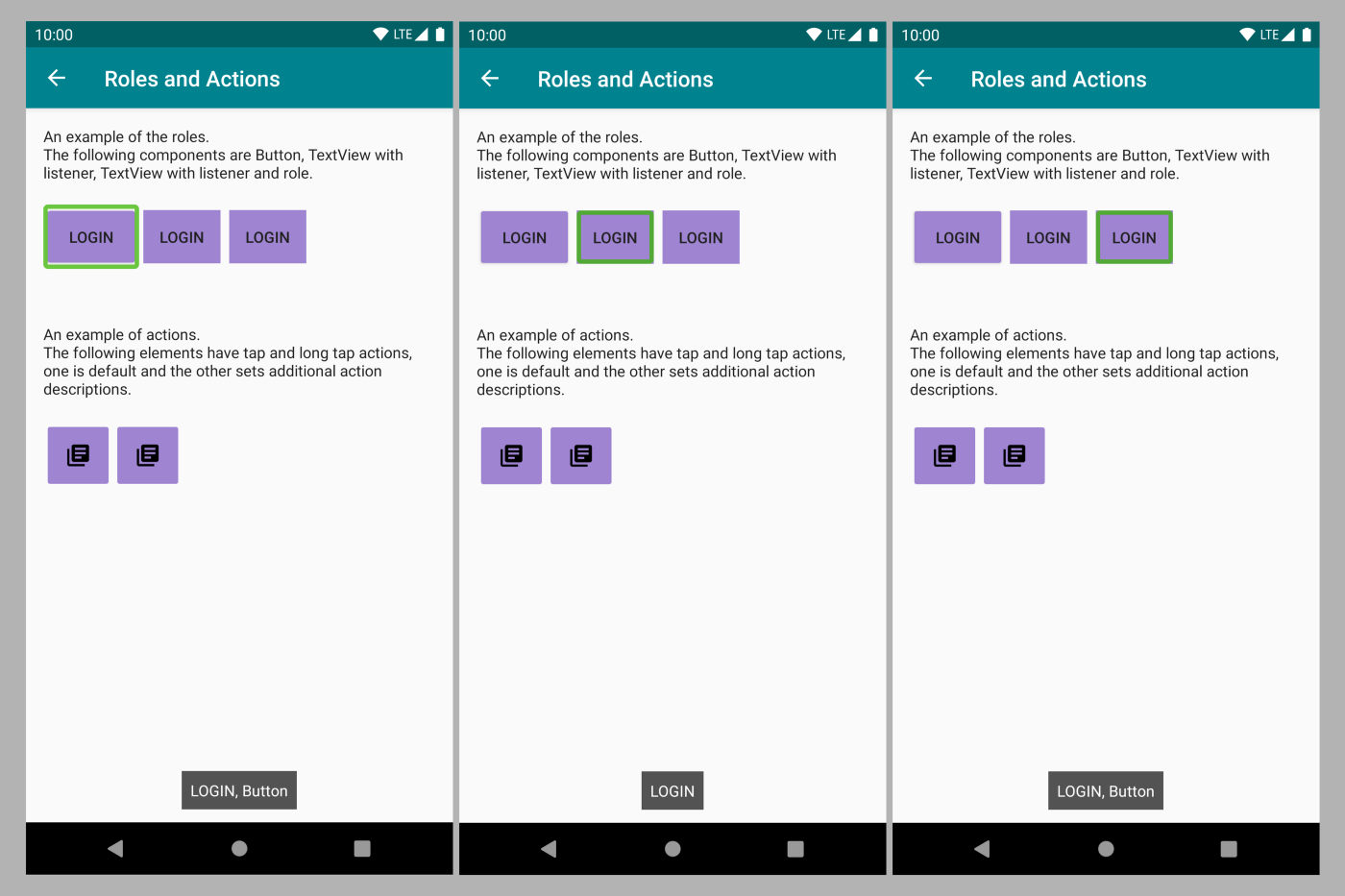
Screenshot showing examples of different types of buttons and Talkback announcements
The button is announced as “Login, Button”. Adding on a click listener to TextView does not include the “Button” announcement. In the last example, TextView is announced as “Button”.
Code snippet
Role is added by including it in the accessibility delegate. This is not an ideal solution; best practice is to use elements as intended, so using Button when Button behaviour is needed, which avoids the need to modify roles manually, as it is easy to miss some behaviour which comes by default. However, in some cases, this will help.
Updating information after state changes
Lint warning often reminds us about adding initial content descriptions, but for the elements with states, this might not be enough. It is important to remember to update accessibility information as well.
Example
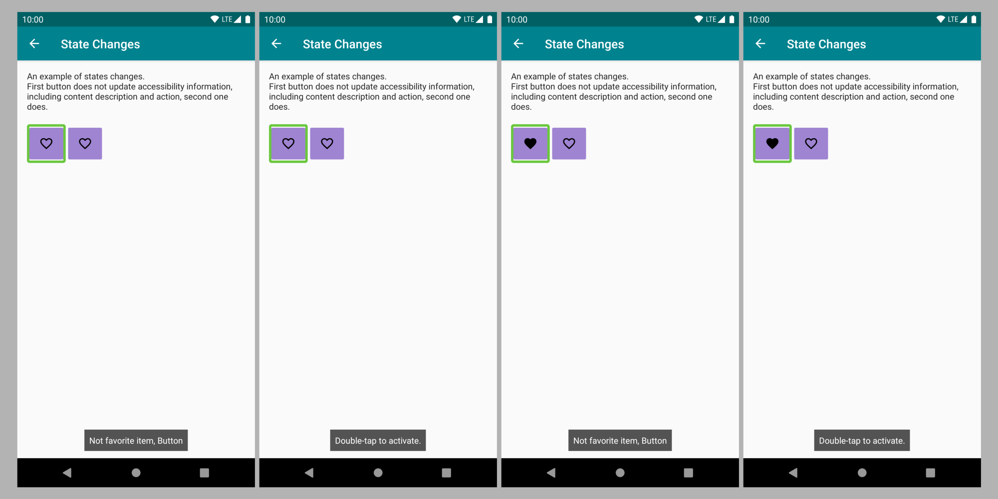
Screenshots showing Talkback announcements for Buttons where UI changes but accessibility information is not updated
The favorite button is not updated after the user taps on it, so the Talkback announcement still reads “Not favorite item, Button, Double tap to activate” after the user already added the item to favorites and the UI is updated to reflect this.
Solution
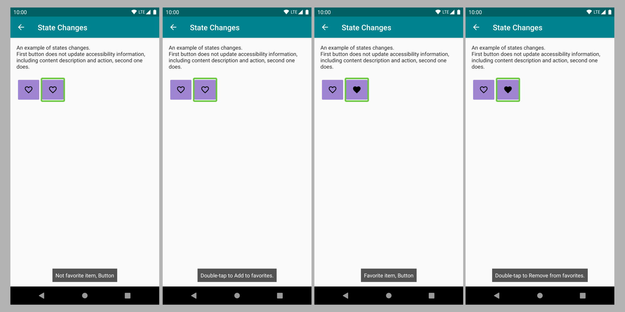
Screenshots showing Talkback announcements with changed UI and accessibility information
Favorite button content and action descriptions are updated so Talkback reads one of two states: “Not favorite item, Button, Double tap to add to favorites” and “Favorite item, Button, Double-tap to remove from favorites”.
Code snippet
When a tap event is received and the element state changes, the content and action descriptions are updated to reflect the current state of the item. This is especially important for elements which represent On/Off state, like the favorite button. Alternatively, an element which already supports On/Off states could be used in this scenario, like Switch or Checkbox. On the other hand, if more than two states are available, then custom elements make sense.
RecyclerView scrolling
If RecyclerView does not automatically scroll with Talkback navigation, it will make it very hard for Talkback users to know that there are more elements available. There is one common issue which usually causes this.
Example
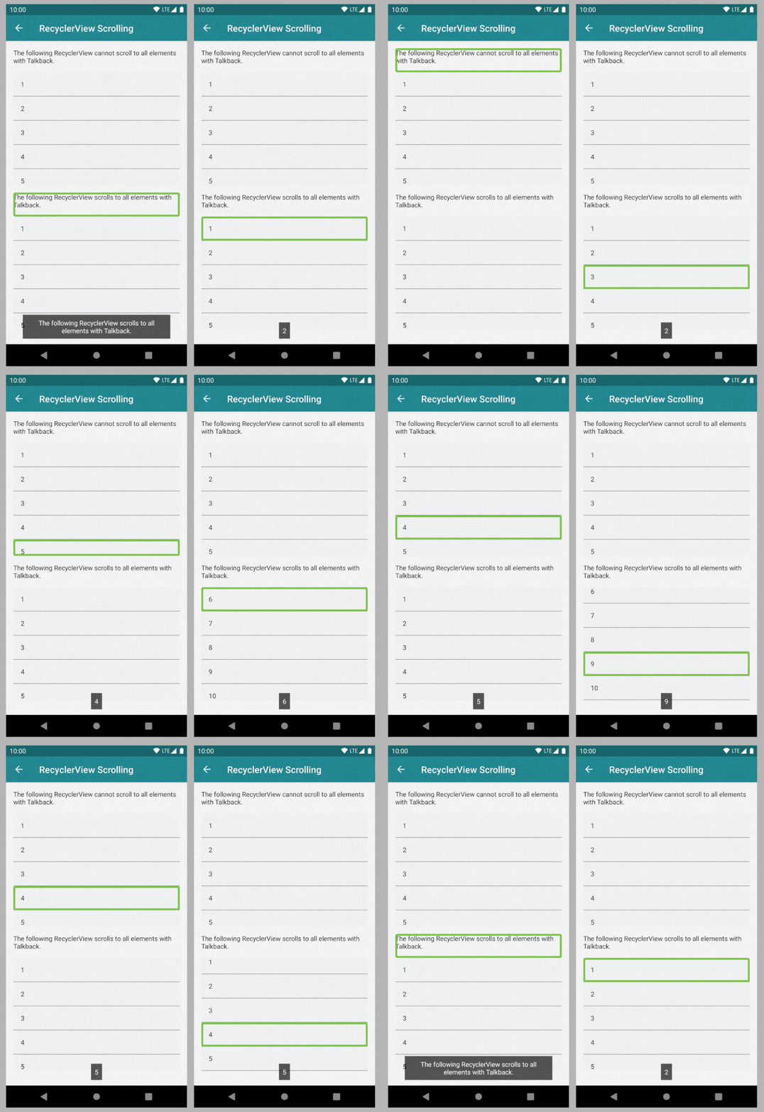
GIF showing side by side comparison of Talkback navigation of scrolling and non-scrolling RecyclerView
The first RecyclerView allows user to see the first 5 elements and then navigation skips the rest. The second RecyclerView moves to the 6th element in the list and scrolls down to make additional elements available. The focus only moves away from RecyclerView when all elements are visited.
Layout snippet
If the following line is in the RecyclerView layout, removing it will fix the issue. It will also add additional in/out of list announcements to help the users navigate.
RecyclerView focus
As is the nature of RecyclerView, it can recycle the view holders if there are changes to the data. However, this can create focus issues if some view is no longer displayed or the view holder is reused in a different position. Understanding what is happening will help with keeping the focus unchanged.
Example
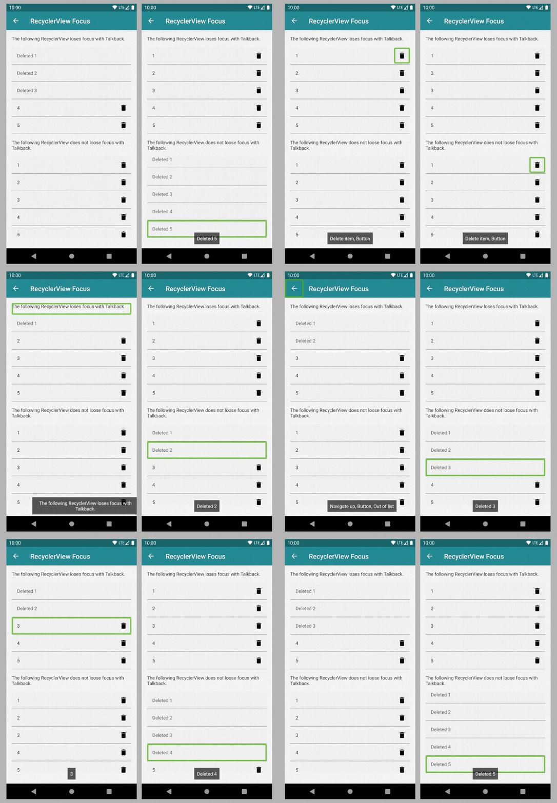
GIF showing side by side Talkback navigation of RecyclerView with focus issues and a fix
RecyclerViews allow the user to mark elements as deleted. In the first RecyclerView, once the delete icon is tapped and the element text is replaced with “Deleted name”, the focus returns to the top of the activity, so the user needs to navigate through the entire screen again to return to the original focus position. The second RecyclerView keeps the focus on the same element, shifting it from the icon to the name.
Code snippet
After the element is marked as deleted there is a short delay to allow RecyclerView time to reuse ViewHolders, then the desired position is found and focus is returned to that position. If the underlying data set is not changed and there is no refresh of the data in RecyclerView adapter, this could potentially be solved within ViewHolder itself. As always, the best solution is the one which addresses the specific need.
Conclusions
Accessibility is important for our team at Microsoft To Do. We spend a lot of time making sure every user can stay organised and accomplish more, independent of how they use their device. Most of our Android app releases include several accessibility improvements. We also work with our design team to consider accessibility requirements from the start.
Accessibility issues we encounter range from simple to tricky - it takes time and dedication to find and resolve them all. I hope this article helps you to solve some. Code snippets in the article have been simplified for clarity, so check the sample code for full implementations.
Is there a different way you would approach some of these? Let’s discuss it!
Notes
Header photo by Skitterphoto.
This article was first published on Android@Microsoft Medium publication here.
